MyCorporation is now into its fifteenth year of business – 15 wonderful years of helping entrepreneurs to create their own small business and get it started on the right foot!
We were one of the first, online document filing services, and the internet was a very different place fifteen years ago. To celebrate our quindecennial anniversary and our heritage as an early online business, we thought it would be interesting to go through the archives and look at what MyCorp’s site used to look like, and how it has changed over the years.
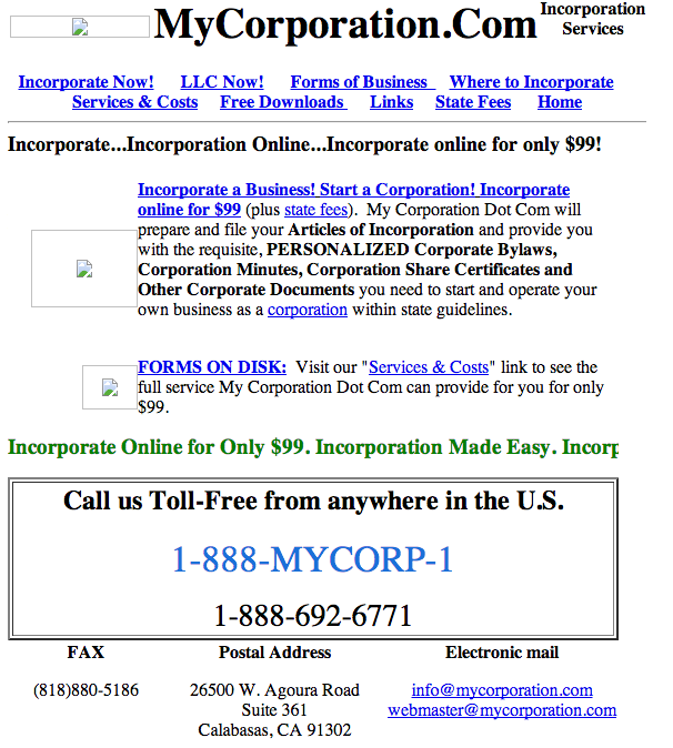
Sadly, our original pictures from 1998 are nowhere to be found, but this page is where it all began. Obviously it was extremely basic – an e-mail address (beautifully labeled as electronic mail), a phone number, and a few instances of early keyword stuffing! Really, we probably didn’t need to make our header ‘Incorporate, Incorporate Online, Incorporate Online for Only $99,’ but it certainly helped us get a good spot in early search engines.
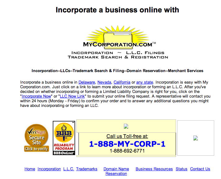
Our first big update was completed in 2000, and that’s when we really began to test the capabilities of early computers – our logo was even an animated gif! But there still wasn’t much in terms of content. Just an e-mail address, a phone number, and a few pages dedicated to answering common questions and outlining the incorporation or LLC formation process.
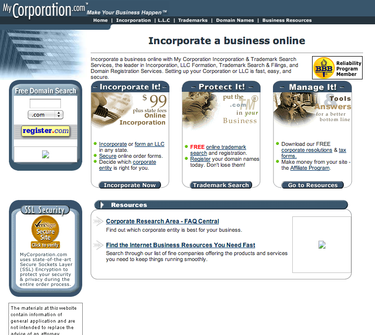
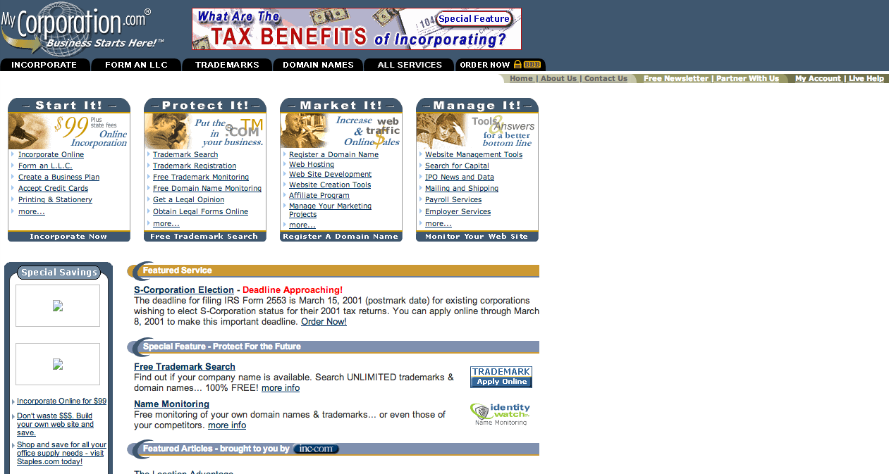
Though it was our first, major update, we didn’t keep the last version up for very long. In 2001 this version of our website went online, and already you can see we went for a drastically different look. It is much more professional, clean, and straight forward. This version would have taken a bit longer to load, but it looked better. Many of the future changes were also heavily built around this template, though we would continue to add information to the front page:
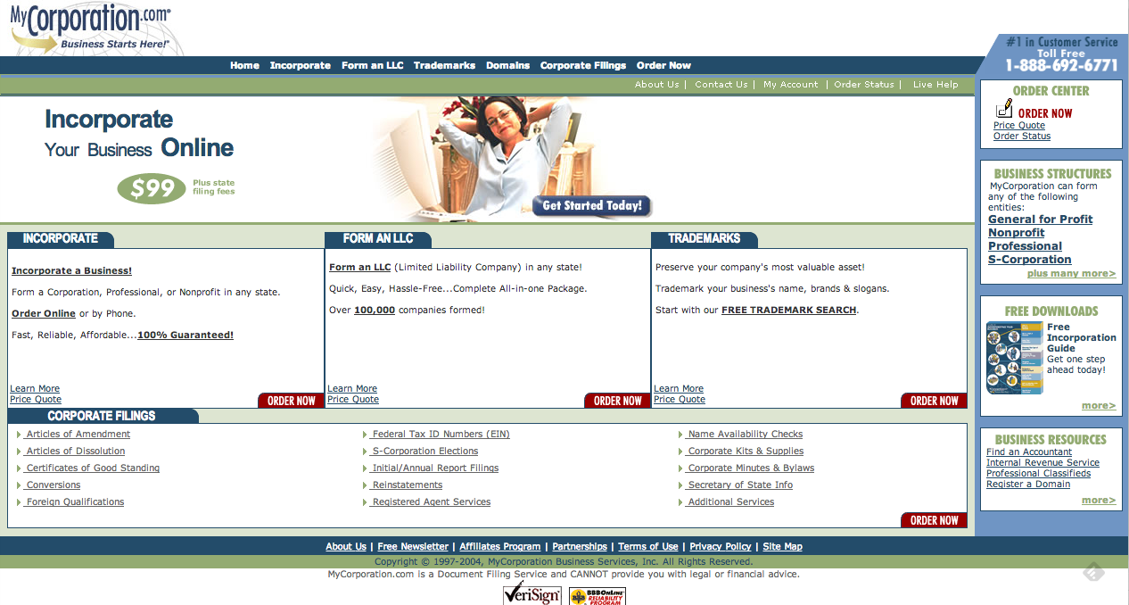
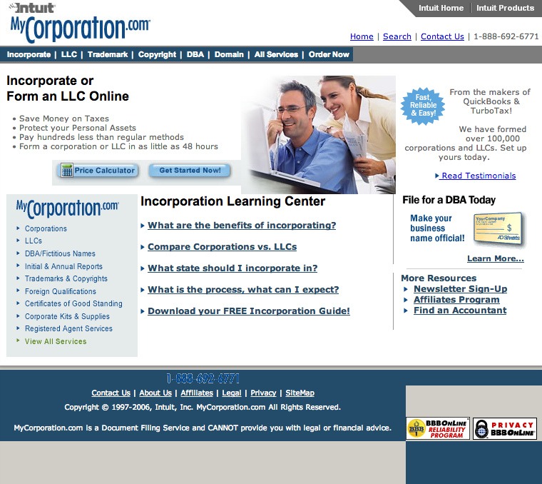
This version of our site obviously took a lot from the 2001-update, though it was a bit more clean. We started to use the sidebar as a navigation tool, and obviously wanted to make it so the user could access all of our most popular services from the front page. This design is actually the one we wound up using for nearly three years.
2004 was another year of change for MyCorp – we got rid of what had then become a fairly stagnant design and changed it completely. We also got rid of all of that gray and injected a bit of color. The green and the blue would both re-appear in later designs.
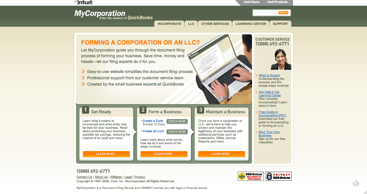
This page went up after MyCorp was acquired by Intuit, and you can see some of Intuit’s brand influencing the design. The gray is back, but it is accompanied by a bit of blue. They were also clearly trying to make it easy to access whatever you needed from the front page, without wasting a lot of real-estate on stock images and content boxes.
This was the second design post-Intuit’s acquisition, and you can definitely see a shift to simplicity. The stacks of sentences and links are gone, replaced with links to a few of our more popular offerings and some information to answer frequently asked questions.
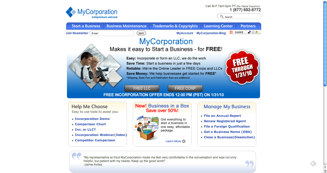
Gone is the green, and Intuit’s logo in the header! After Deb stepped in as CEO in late 2009, MyCorp underwent a bit of a makeover, getting a new logo and a new affinity for the color blue. This version of the site is a bit more fun and colorful, the perfect start to a new era. This is also the first time the blog was linked on the front page!
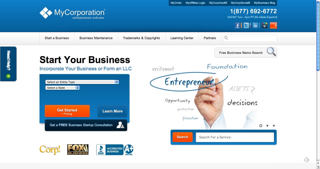
You can see a lot of 2010 in 2012’s redesign, though it is clear that we tried to reign things in a little bit and get our content to look a tad more orderly. We stuck with the blue, and begun experimenting with integrating social media into the site.
Finally, we have our current design – we wanted to try and clean up the front page a little bit, while giving the site a more contemporary feel. The header now features a negative of our current logo, and a search function has replaced some of the clunkier navigation tools we had featured in the past.
MyCorp has changed a lot over the past fifteen years, but we are just as dedicated to helping small business owners now as we were in 1998. We’d like to thank all of our customers and clients for their support, and we hope that you all will allow us to continue to help, advise, and guide you as you build your own small business.
Thank you, and we are all looking forward to another 15 great years!
All screenshots are courtesy of the Internet Wayback Machine and the Internet Archive Project.
